Brand identity for a paid media studio
Client
Year
2026
Samuroi helps businesses get more out of their Google and Meta ads. Most ad agencies look the same: blue, techy, full of graphs. Samuroi wanted to stand out with something bolder and more human. A brand that feels sharp and confident, but still easy to talk to. My job was to create a brand to match that.

The Idea
The name already had a lot going on. A samurai is disciplined, focused and precise, which is exactly how good ad management should feel. So I built the mark around a gate, like the entrance to a dojo. It's the place you walk through to train and get better. That's what Samuroi does for an ad account. The red shape inside the gate is the heart of the logo. It reads as a rising sun, a doorway and a screen at the same time. I kept the edges slightly rough on purpose, like they were cut by hand. It gives the brand a bit of craft and warmth, so it never feels cold or corporate.

The details
The colours stay close to the samurai world: a deep red, black and a warm off-white, with two blues for the website and the digital side of things. I also made a set of three gate icons, each with its own symbol inside. [Add what they stand for, e.g. the three services or pillars.] They work as a small icon family for the website, social media and merch.

The website
A one-page website for Samuroi that turns the bold brand into a clear, easy path from first visit to booking a call.

Stella has become a cornerstone of my business. I hand over the creative management for my Meta campaigns to her, and she always grasps my ideas quickly and brings them to life exactly as I envision them. Now I can keep my campaigns updated every month and drive far more results.
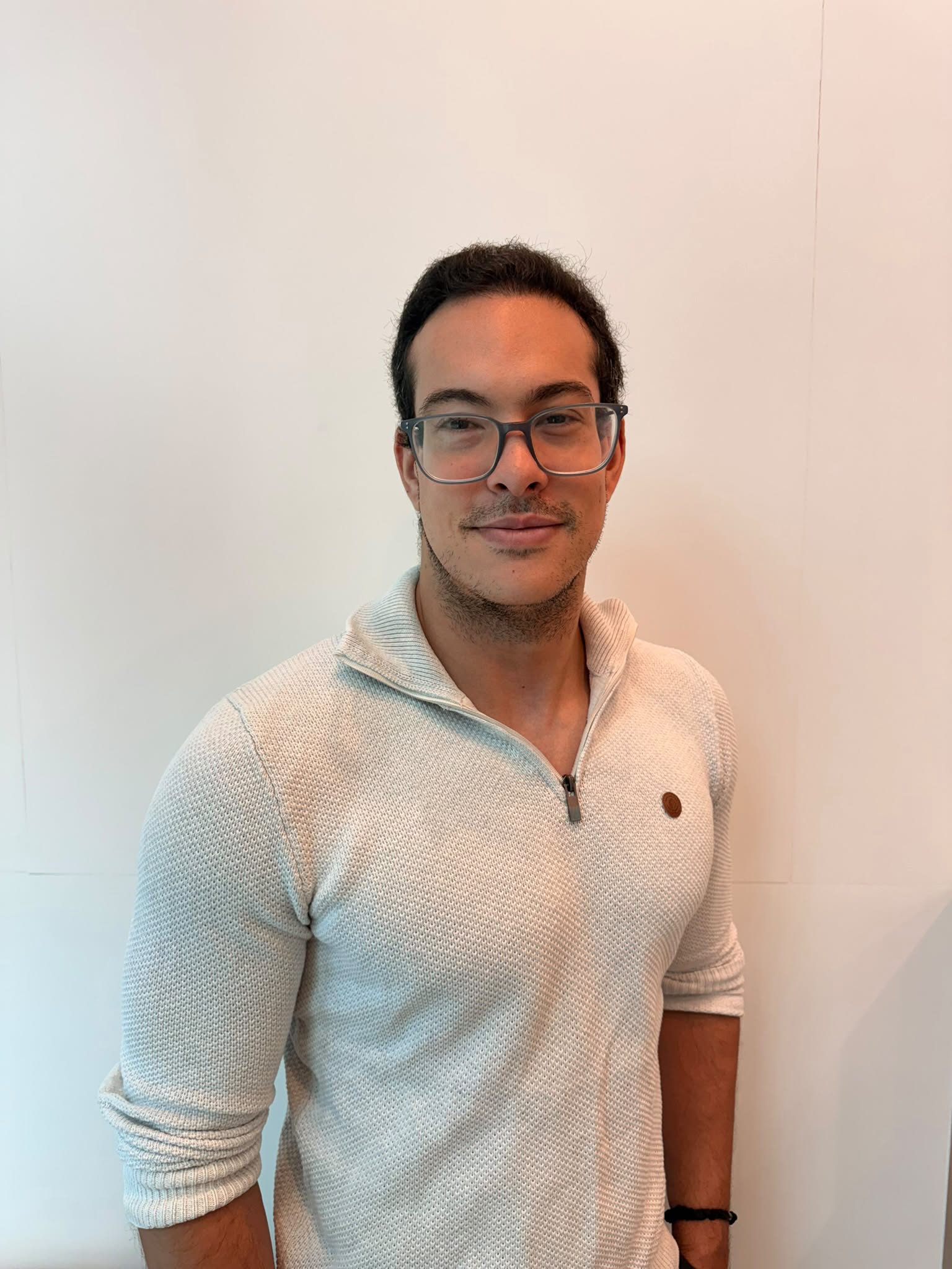
Samuel Rodríguez García
Paid Media Expert & Founder Samuroi Media