Complete Branding For Dutch Consultancy Firm
Client
Moncy
Year
2025
Moncy helps entrepreneurs and their teams grow. Not with standard solutions, but with strategic insight, practical guidance, and a human approach. You see that combination reflected in everything we do and in how we look as a brand. The briefing was clear: to create a modern brand that fits their values.

Brand Mark
The ‘O’ of Moncy is more than a letter; it is a symbol of progress. With its flowing shape and characteristic dip, this brand mark reflects the natural movement of growth: not perfectly straight, but dynamic and real.
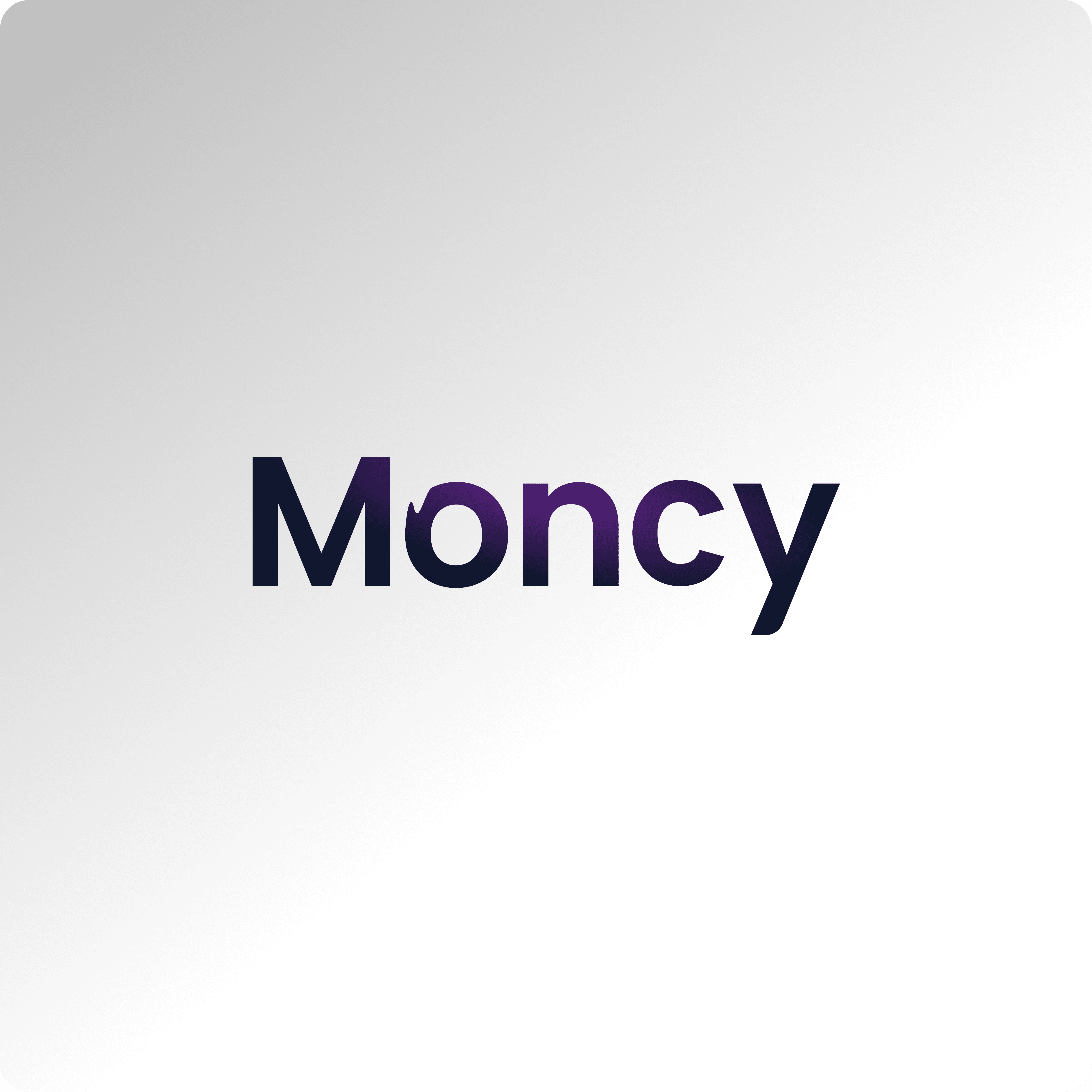
Full Logo
A clean, bold, modern logo with a slight gradient. The Moncy logo is sleek, modern, and powerful in its simplicity. The name is written out in a geometric, rounded font that feels professional and accessible. The subtle transition from dark blue to purple reinforces movement, growth, and transformation. Exactly what Moncy stands for.

Branding Snapshot
A reflection of Moncy through simplistic but strategic branding