Why visual consistency breaks at the fourth surface
I see it often at companies that have been around a while. The feed is sharp, the packaging feels different and the email header looks like it came from another company. That pattern almost always starts at a handover, when one person passes the work to the next.
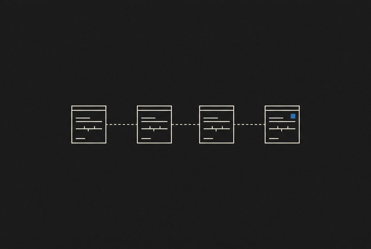
In this piece I explain why visual consistency is mostly a question of ownership. You read how four surfaces, the ad, the packaging, the email and the landing page, each get their own job and their own maker. Then we look at where it goes wrong at the handover and why your brand identity needs more than a guideline alone.
Finally I show what it takes to turn that around. It starts with one person guarding the brand across all four surfaces, with one rule set for typography, colour and image treatment and one template per surface. I close with what that asks of you in practice, from the first call to the last file.
Four surfaces, one brand, four separate jobs
Your brand identity is one thing. The ad, the packaging, the email and the landing page are four separate jobs. Each has its own maker, its own deadline and a short brief of a few lines.
With two surfaces, alignment still fits in someone's head. As soon as a third and a fourth come along, someone joins who never saw the first two. That person does fine work, just not the same work.
I see this at growing brands the moment a paid channel arrives next to the webshop. The ad stands out in the feed, and still does not fit next to the pack.
Recognition happens the moment someone scrolls past your work or holds your product. That moment differs per surface, and that is exactly where it goes wrong.
Where visual consistency breaks: at the handover
The break point sits between people. The handover between teams is where it goes wrong, not the logo.
As soon as work leaves the door automatically without a review step, it slides. The maker does not see it, because they judged their own piece.
A concrete example: the pack is approved by production, the ad by performance, the email by someone from support. None of them keeps the whole in view.
So your brand identity is the agreement about who may decide when something deviates from the rest. Sending a file around does not arrange that.
In my experience: at three surfaces it has to be written down, at four someone has to guard it actively. One person guarding the whole is the first step.
The ad: made to stop, by someone who does not see the rest
The ad is the first surface where this becomes visible. An ad has one job: stop someone in the middle of a feed. Contrast does that work, with a hard headline and often a bright colour.
The maker usually gets a short brief with this week's offer. The rest of your brand does not come past. The briefing is about the campaign, while your brand identity is about everything.
Performance teams adjust on daily numbers. Every adjustment is a small deviation from the rules, and after twenty variants there is a style of its own next to your brand. A creative working less well over time is a known pattern in research into creative fatigue.
What helps is one ad template with fixed places for the headline, the product and the logo, and room to vary within those places. That way the form stays while the offer changes. I use the same frame for branded videos.
Where it comes loose is the review. The ad is measured on clicks, the pack on production, the email on forwards. Nobody judges the whole, and that is where the four surfaces drift apart.
The packaging: the surface nobody sees again after production
The ad leaves your hands the moment it goes live. The pack does not. It goes through a supplier and a printer, and they work to their own specifications, not to your brand file.
Colour is the biggest source of drift here. A brand red on your screen becomes a different shade on cardboard when printing happens without a colour profile. Every printing condition belongs to a material, and a colour profile that does not match the current cardboard gives a deviating result.
The pack also has a job the other surfaces lack. It has to stand next to competitors on a shelf and be recognised in one second.
That is why for packaging I usually deliver a digital file with fixed colour values and a short instruction for the printer. That instruction saves more than an extensive brand manual, because the printer will read it.
Where it comes loose: the pack is set up once and then only reprinted. Every reprint inherits the deviation of the previous one. With email that same habit starts, only faster.
The email: the header that was made once and never came back
With email it is worse: that mail is made once and then never looked at again.
Transactional emails are a weak point. Campaign emails follow the guidelines, the confirmation and shipping mail often do not. That last one is set up by someone who mainly got the technical side working, and after that nobody touches it.
A year later there is a logo in it that you already replaced. The button has a colour that comes back nowhere else and the font no longer exists on your site. You only notice when a customer opens a mail after their order that does not look like yours.
Email therefore asks for extra rules. A fixed header height, safe margins around the text and a button style that works in every email client.
For clients I build one email template with fixed blocks. The editor fills in the text and the offer, the form is fixed. With the landing page that is different, because there someone else usually builds on.
The landing page: where the brand is handed to someone else
With the landing page you really hand over your brand.
That page is built in a different tool than the ad, often by a developer or with a theme someone bought once. Often that developer delivers the campaign page without ever having seen the ad.
The ad promises something. The page has to promise the same thing, in the same words and the same images. A bright orange button in the ad and a dark green one on the page feels like another world.
Headlines and button styles here most often come from the theme instead of from your brand. That is where brand and brand identity drift apart in practice: your brand sits in your rules, your recognition sits in the theme.
What works is one hero template with fixed places for the headline, subheadline, button and image, and fixed spacing between the elements.
Where it comes loose: the page is adjusted per campaign, without anyone placing the previous version next to it.
Why guidelines alone do not hold it
A style guide is a reference work. You open it when you want to look something up. A document does not step in when it has to.
Your brand identity is in it, your recognition sits in the execution. Those two drift apart as soon as it gets busy and someone hits a deadline.
Figures exist on how many brands have guidelines and how many really use them, from research that is not named further. I use figures like that only as a signal. One supplier report mentions up to 23% more revenue at more consistent brands, but the original report cannot be found, so that stays an indication.
Templates with fixed parts keep the brand standing while the content changes. Other providers sell brand governance tools with cards and review steps. I read their approach as an example.
That approach is the same as my fixed blocks per surface. I explain the basis in the frequently asked questions about a brand style guide.

One person guards the brand across all four surfaces
Enforcement asks for a person. Appoint one person who guards your brand identity across the ad, the pack, the email and the landing page. At small brands that is you, at larger brands it is one designer or marketer.
That person does not have to make everything and lays every surface along the same rules before it goes live. That is why I work with a weekly check-in and fixed delivery days. Every week we look together at what has slid between surfaces.
With me you get a fixed price before you decide, so you know up front what the whole route costs.
One rule set for typography, colour and image treatment
That one person needs something to work with: one rule set that fits on one page. A set of five pages gets ignored just as often as a manual of forty.
Typography: two fonts at most. Fix set sizes for headline, subheadline and body, and write down where you use which.
Colour: fix values per medium. Print gets its own value, because screen colour and printing ink differ. That way your brand red on cardboard stays the same as in the feed.
Image treatment: one approach for photos. The same crop, the same contrast and the same way of cutting out the product, on every surface.
Put those rules in Figma as styles and components. There someone uses them without thinking about it, while a pdf has to be read first. For a landing page that works just like responsive design, where fixed rules per breakpoint do the heavy work.
These rules are the basis. On top of that, each surface gets one fixed frame.
One template per surface, not four separate designs
The rules are fixed. Now each surface still needs a frame, because otherwise you design the ad, the pack, the email header and the hero from scratch every time. In that frame the logo, headline and button get a fixed place. The rest is room for the week's offer.
Within those places everything may move: text, offer, campaign, season. That way the brand stays standing while the content changes. I work the same way: fixed blocks per surface.
One template per surface is also an agreement with yourself. Whoever touches the frame takes something away from the other three.
Start with the surface where it goes wrong most. That is almost always the email header, because it lies unguarded the longest. Then the hero, then the pack and the ad.
I make those templates in Figma and Framer, so the same rules work for a pack, a mail and a landing page. The frequently asked questions about templates and designs give you a starting point.

What this asks of you in practice
A template only works once someone owns it. Put that in the job description instead of in a conversation.
You can read more about those agreements in brand management best practices.
Make the review a fixed step in your week, with one moment where the ad, the pack, the mail and the page lie next to each other. Always bring the first version of a new surface to the check-in, because that is where you see drift the earliest. That is how people recognise your brand when they scroll past your ad, open your parcel or open your mail.
Conclusion
Visual consistency breaks at the handover. Guidelines alone do not hold the brand. One person has to own the ad, the pack, the mail and the landing page, and that agreement belongs in the job description, not in a conversation.
Start with the email header, because it lies unguarded the longest. Then plan a fixed weekly check-in where you lay all four surfaces next to each other.
Veelgestelde vragen
Waarom breekt visuele consistentie vooral bij de overdracht?
Het breekpunt zit tussen mensen, niet in het logo. Bij een overdracht van werk van de ene persoon naar de volgende raakt de samenhang kwijt. Zodra werk geautomatiseerd de deur uit gaat zonder reviewstap, glijdt het weg, en de maker ziet het zelf niet omdat die zijn eigen stuk beoordeelde.
Welke oppervlakken horen bij een merk en wie maakt ze?
De post noemt vier oppervlakken: de ad, de packaging, de e-mail en de landingspagina. Elk heeft een eigen maker, een eigen deadline en een korte brief van een paar regels.
Waarom zijn richtlijnen alleen niet genoeg om een merk vast te houden?
Een style guide is een naslagwerk: je slaat het open als je iets wilt opzoeken, maar het grijpt niet in wanneer het moet. Je brand identity staat in de richtlijnen, maar de herkenning zit in de uitvoering, en die twee lopen uit elkaar zodra het druk is en iemand een deadline haalt.
Wat is de eerste stap om visuele consistentie te herstellen?
Wijs één persoon aan die de brand identity over alle vier oppervlakken bewaakt. Die persoon legt elk oppervlak langs dezelfde regelset en template voordat het live gaat. Begin bij de e-mailheader, omdat die het langst onbeheerd blijft, en plan daarna een vaste wekelijkse check-in waarin alle vier oppervlakken naast elkaar liggen.
Welke regels moeten er in de regelset staan en welke template heeft elk oppervlak nodig?
De regelset bevat typografie (maximaal twee lettertypes met vaste groottes voor kop, subkop en body), kleur (waarden per medium, met een eigen waarde voor drukwerk) en beeldbehandeling (één aanpak voor foto's). Per oppervlak is er één template met vaste plekken voor logo, kop en knop, terwijl tekst, aanbod en campagne mogen wisselen.